Friday, 30 April 2010

Monday, 26 April 2010

Evaluation

1. In what ways does your media product use, develop or challenge forms and conventions of real media products?
Our film incorporates generic conventions of the horror genre. We have used the following conventions: Dark lighting, an unrevealing killer, a gun and an open/abandoned area. We have used these convention in our opening sequence to make the audience build up their fear, especially after the audience see the unrevealing killer fire two guns shot. This also builds up tension for the viewer as although the camera does not show who the killer is shooting at, buy yet the audience know who has been killed. These conventions also indicate within our sequence that it is a psychological horror film and this is clear to the audience because we have included a revenge killer in our film. Our film could link in with a film called ‘Wolf Creek’ because the film is based in an ancient creek and at first they think they are alone and safe, but however, they are not.


2. How does your media product represent particular social groups?
In our film, we haven’t really got a social group, its just based on a teenage couple. In terms of the age, they are 18 years of age and want to get away for a weekend, like a typical middle class young couple. It’s a boy and girl, (Sam & Sarah). The two genders are represented in a typical male/female role. The gender isn’t represented in a stereotypical way, as the killer in our film is a female. Usually in horrors the killer tends to be a male. But as our film is about revenge, the female takes the action on the couple that is away for the weekend and sets out to kill them. The target audience is around 15+, and the people in our film are teenagers, which then the audience can relate to if they are teenagers around similar ages and interest.


3. What kind of media institution might distribute your media product and why?
We haven’t gone for a Hollywood studio release film; this is for major films, which does not fit with the opening sequence that we have created. Also we don’t have any major actors or actresses playing the roles of our characters, we just have C list actors and actresses. This is because we don’t need major actors and actresses, as our film is based on the storyline and not how important the actors and actresses are.


4. Who would be the audience for your media product?
The age group that our film is aimed at is 15+, we chose this because it isn’t to threatening. I think if we added gore and self harming scenes then our target audience would of moved up to be a 18. The film is torn between two genders, It doesn’t aim to any particular one, I think both could watch it and get the same effect, whereas I feel if it was two males in it and was a bit more action or gore, I think it would appeal more to the male gender. Other films that are similar to ours are probably Wolf creek, this is also about a group of people who plan to go away and it all goes wrong, they end up being stranded in the middle of nowhere and getting brutally torched. The second film that is similar to ours is Texas chainsaw massacre, they also have a teenaged group wanting to get away and they enter a house, which doesn’t turn to good. Another aspect to our films is Revenge in the narrative. Scream has a lot of revenge in the film which makes it similar story lines, as we have the killer who is a jealous teenager wanting to get her own back on the teenaged couple. We chose to set the film in a very open space, abandoned space, like many horror films, where if the group need to scream.


5. How did you attract/address your audience?
At the end of our opening sequence we have ended it by showing the killer firing two gunshots. This comes across as quite shocking to our audience and leaves them thinking whether the victims are dead or not. We have also included different types of camerawork within our opening sequence so that we can show different point of view angles, such as: the over the shoulder shot of the killer watching her victims. Our audience is in the position of the killer, and we have deliberately done this so that the narrative becomes an open narrative and the audience knows what is going on but the characters don’t. However, by the end of our opening sequence the narrative changes to a closed narrative, as we don’t want the audience to witness the shooting, which makes the audience think about whether the killers victims are dead or not. This is good for the generic conventions of horror films because it adds suspense for the audience and adds a sense of tension between the narrative and the audience. Looking at our audience feedback we got a variety of different rated levels for different parts of our film. We asked a variety of different audience to watch our film (mainly focusing on our target audience) and rate us on different sections of our opening sequence, the ratings were: Minimal, Basic, Proficient and Excellent. Looking at the ratings we got, the majority of our audience rated our opening sequence as proficient.


6. What have you learnt about technologies from the process of constructing the product?
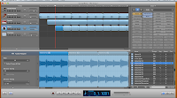
At first, we had no experience with the camera, but by practicing and making a rough cut; it helped to improve our film cut. We also didn’t know how to zoom in and out on the camera, but with practice we figured this out. We came across a difficult issue when filming, which was the ground was at different levels which made it slightly difficult to film, but we managed to make the tripod more flat my changing the lengths of the legs. Once we had finished filming, we inserted the recorded scenes into ‘iMovie’. We then, added a darkening effect to the whole sequence so that we had the key convention of dark lighting. This made our opening sequence look more like a horror film. We then needed to add a soundtrack and gun shot sound effects to our sequence. We did this using ‘GarageBand’. We created a major/low key soundtrack to add to the effect of our sequence being a horror film, we also chosen a gun shot to match the sound of the gun at the end of our sequence. We then inserted these to match the righting when the killer shoot the gun – this added the real effect of a gun shot in our film.


7. Looking back to your preliminary task, what do you feel that you have learnt in the progression from it to the full product?
We started our preliminary task by researching into the genre of horror films and writing a short analysis of an opening sequence of a horror film. This helped to see the use of different camera shots used and different sounds used to create the horror atmosphere. We then researched into more depth and researched into the horror genre, which was useful and helped us to add the important conventions of horror films. After this research, we began to create our storyboard and decided to base it on a getaway adventure – located in an abandoned area. Once we had come up with our storyline we then began to draw out the different shots we were going to shoot within our opening sequence and produce it as an animatic. By doing this it helped to shoot our opening in order of shots – and we knew exactly what shots we were doing and help run this smoother. Some of the shot we used on our first rough cut did not work out as well as we thought and didn’t no look as good when we put all the filming together on ‘iMovie’. We then changed some of the shot types and added some jump cuts to break up some of the sequence. Overall, I think we have produced a good opening sequence of a psychological horror film and we especially like how we have ended the opening sequence by having the killer firing two gunshots, but however, we have left the audience thinking about whether the killers victims are dead or not.

Tuesday, 20 April 2010

Tuesday, 23 March 2010

Extras
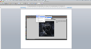
Company logo & how it was created

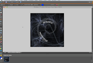
This is a screen shot of how we created the
 obscure text to fit in around the swirl. Our
 background was cropped out of a image from 
google and we changed it to fit around out title.


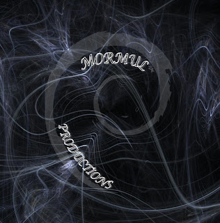
This is the finishing 
edit of the logo and 
we are now ready to 
use it on our film.


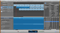
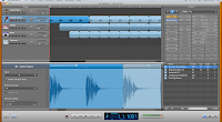
How we created our music using Garage Band:


assesment 9

Rough Cut


This is the rough cut of my opening sequence. I intend to improve on the following things:
- Improve on the titles
- Add company logo
- Clip adjustments e.g. jump cuts & darkening the lighting
- Re-shoot and finish shooting the ending
- Add sound effects & soundtrack
-

Wednesday, 24 February 2010

Thursday, 11 February 2010

assesment 7

Shooting schedule.

Wednesday, 10 February 2010

assesment 6

Actors

Sarah Moran - Teenager no.1 - Camera man
Sam Larkin - Teenager no.2
Hayley Mullender- Car driver - Camera man
David Holt- Serial Killer


Location
Hartlepool
In the car
Crimdon Dene


Costumes
Casual
Warm camping clothing, huddys, joggers etc...
Dark clothing (trousers, hooded coat)


Props
Car
Music 
Ipod
Sleeping Bags
Luggage
Tent
Logs
Food and drink
Gun
Mask or makeup

Tuesday, 2 February 2010

assesment 3

Target Audience


Films which are rated at 15, means that those aged 15 and above are able to view the film. This also mean that no one under the age of 15 can view the film at cinema or rent or buy DVD's and Games at this rated certificate. This also applied to rated 18 films.

The films must not show violent behavior or language to the audience, it can show drug/alcohol abuse but mustn’t promote it within the film. The genre of horror can show strong abuse and threatening gestures. Characters behavior such as being hung, suicidal happenings and self-harming can be shown in horror, but not constantly appealing throughout the film as the audience watching could imitate or copy it and therefore lead to dangerous incidents. Weapons such as guns and other harmful weapons should not be in the audience’s face as a centre point all the time as it could give a fright or be a bit nervous for the audience. Strong language is used a lot in horror as it shows the tension the characters are feeling, words such as ‘fuck’ and ‘shit’ are main strong language words used quite a lot in horror as it can relate to anyone’s feelings.
The use of nudity is allowed in a sexual content but not with strong detail or references, along with sex can be portrayed without strong activity being shown. There can be strong verbal references to sexual behavior, but strongest references won’t be allowed unless the context is necessary. There is generally no theme around this age category as long as the film is appropriate for 15 year olds. There can be strong violence in 15 films but shouldn’t dwell on the behavior or injuries. Strong ‘gory’ images are unlikely to be seen in 15 films along with sexual violence such as rape. If there was to be sexual violence, it would have to justified strongly, although there can be references to this behavior.


This specific rating, films can only be viewed by adults (people of age 18+). Although it is pretty much the same as rated 15 films, R18 films can be stretched to more extreme things. This could be that the film has used a great deal of strong language or explicit scenes of sexual activity. The film could also encourage violent behavior or harm to individuals, for example: detailed scenes of violent or dangerous acts, or of illegal drug use within the film. Also sexual violence, for example, could endorse sexual assault.

Top 10 Slasher Horror Movies
Rank Title Studio Lifetime Gross /Theaters Opening / Theaters Date
1 Scream
Dim. $103,046,663 1,994 $6,354,586 1,413 12/20/96
2 Scream 2 Dim. $101,363,301 2,688 $32,926,342 2,663 12/12/97
3 Scream 3 Dim. $89,143,175 3,467 $34,713,342 3,467 2/4/00
4 Freddy Vs. Jason NL $82,622,655 3,014 $36,428,066 3,014 8/15/03
5 The Texas Chainsaw Massacre NL $80,571,655 3,018 $28,094,014 3,016 10/17/03
6 I Know What You Last Summer Sony $72,586,134 2,524 $15,818,645 2,524 10/17/97
7 Friday the 13th (2009) WB (NL) $65,002,019 3,105 $40,570,365 3,105 2/13/09
8 Hallowe'en (2007) MGM/W $58,272,029 3,475 $26,362,367 3,472 8/31/07
9 Hallowe'en: H2 Dim. $55,041,738 2,669 $16,187,724 2,607 8/7/98
10 My Bloody Valentine 3-D LGF $51,545,952 2,534 $21,241,456 2,534 1/16/09


Wednesday, 27 January 2010

assesment 2

HOSTEL

http://www.megavideo.com/?v=O3I1A090


Analysis of the opening of Hostel (2005).
Credits:
Quentin Tarantino Presents A Next Entertainment/Raw Nerve Production
Starring:
Jay Hernandez
Derek Richardson
Eythor Gudjonsson
With: Jan Vlasak
Barbara Nedeljakova
Jana Kaderabkova
Jennifer Lim
& Rick Hoffman
Casting:
Kelly Martin Wagner
Special Makeup Effects Design and Created by:
Gregory Nicotero
Howard Berger
Music by:
Nathan Barr
Edited by:
Geroge Folsey JR a.c.e
Production and Costume design by:
Franco Giacomo Carbone
Director of Photography:
Milan Chadima
Co Producers:
Daniel Fleiss
Eli Roth
Chris Briggs
Written and Directed by:
Eli Roth


The opening of hostel shows micro themes within the opening sequence that represents horror, at the start you hear the blood trickling and splurging away as if its going down a drain or a flow to somewhere mysterious, also over that you can hear whistling, as if it is getting closer, this is a non-synchronous sound as we hear it but we do not see it until further in the film. The camera cross cuts to another room, it looks sewer like, the lighting is very dark as it makes it very spectral, the splurging of blood still occurs throughout this opening as we can hear it over still, also with the whistling getting louder, it then jump cuts scenes to a close up on a puddle where we see a reflection of a blue neon sign reading HOSTEL but this is backwards and flipped, all of a sudden whilst still focusing on the puddle a loud non-diegetic incidental sound appears it creates a tensional feel as we don't know what is going to happen, then we see, close-up, a trainer stomping into the puddle which is in sync with the heavy beat that was playing, the camera then pans up on the guy who stomps into the puddle, we then focus on him in a medium long shot walking into a hostel, it is early day, so the lighting used is natural, this represents the start of the day, we then swap character positions as the other guy walks through the door we change and jump to focus on a group of three guys walking out of the hostel, the noise isn't really dramatic or striking in this part until they get outside and we hear diegetic sounds, like people talking, bells of bikes cycling past, birds cheeping etc.. these are known as ambient sounds. The mise en scene is quite low class as the paintwork on the buildings is quite worn away and the clothes of the people are quite down standard with typical combat like trousers and hooded jackets, the colours are quite dull and matte, throughout the opening set, the other people are mixed in well with these as their outfit/costumes are very similar, the setting looks quite a urban area with the torn down posters stuck up around the area. The music starts to play fast beats like from a guitar then you hear the characters begin to talk and the camera pans up to the neon blue sign we saw earlier in the film saying Hostel, this represents the title of the film which is a different way to show what the film is about by focusing on the sign which stands out from the dull surroundings. The camera focuses on the three guys walking away from the Hostel then the camera match on actions to them walking towards the camera laughing and messing around, the surroundings are of a typical urban city life, people cycling, cars parked up on the road side, yet their is still non-diegetic music playing over the top. The camera then zooms in to a medium close up on the three guys wallking around the corner, dialouge then comes into the film as they start discussing what they can get up to, the camera cuts and there is a close up on one of the guys lighting up a ciggarette, this is a flashback of what happend the last time they went to amsterdam, this shows you that the type of place they are in isnt a very high class as smoking is obvisously allowed in the place, the sync isnt the same as what is being said as it is showing you what happend and then the guys are talking over the top of it saying what they enjoyed etc.. we then go into a nightclub scene from where they had visited, the lighting is quite dark with strobe lighting effects and neon lighting, the music is very beaty and loud to represent the rush and excitement at the scene. There is alot of shot reverse shots in this scene where the characters are talking to each other and dancing around, we then cut away from the medium long shot of the group and focus in onto the guy opening his bag to get out money to buy more drinks. The lighting is still very dark so the characters are only visiable from the lighting thats shown in the club, also the music is still playing the heavy beats which gives a sence of hype, the group split and the camera zooms into a close up of the two guys who are having a kind of argument, you see this by the strong language and tone of voice they are using. This opening sequence doesnt really show horror, but the use of camera mise en scene and sound play a big role in this.

Tuesday, 26 January 2010

Wednesday, 20 January 2010